This page contains tests for gauge chart type defined as data-type="gauge".
Gauge chart type consists of a semi circle with needle pointing at the target value over styled and calibrated areas. Figure 5a can be consulted for various elements and vocabulary used in this documentation.
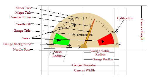 Figure 5a
5.1.1 Configurations of Gauge Chart
5.1.1.1 Areas used to provide styled segmentation of gauge reading and can be configured by data-areas. The value of
data-areaswill hold sets of desired segments with each in the format[<value> '<style>'](Both sets and values within sets must be separated by a single space). Wherevaluerepresent the ending limit of segment and should be within gaugerangeand style represent the fill style of segment arc and must be provided according to the reference without using color keywords.5.1.1.2 Range specifies the start and end value of gauge reading and configured by data-range. This range will map to
Gauge Value Radiusas specified in the figure. Default is1 1005.1.1.3 Calibrations is used to provide custom calibration strings. If calibration is enalbed by providing
calibration:trueindata-opts, the gauge will calibrate the Major Ticks according to Gauge Range. This calibration can be overwritten by configuring gauge with data-calibrations in a format['TextforMajorTick 1' 'TextforMajorTick 2' ... 'TextforMajorTick N']. (Note: The number of major ticks drawn are 1+ConfiguredMajorTicks)5.1.1.4 Options configured as data-opts. Various options can be provided to optimize gauge size, ticks, needle, needle target and styles of gauge elements etc. Options are provided in key:value format e.g.
key1:value1 key2:'String Value'. Key:Value must be distinguished by a single:with no space whereas different key:value pairs must be separated by a single space and strings containing space must be enclosed within Single Quites (''). It is recommended to enclose all non decimal values within single quotes. Available options for Gauge Chart are explained below.-
5.1.1.4.1 Options for Gauge Chart
widthRatio, heightRatio Gauge Diameter size can be controlled by providing a ratio of Gauge Diameter to either Width of Canvas by
widthRatio:vor to Height of Canvas byheightRatio:vwhere v is the ratio value for Gauge Diameter. Default is0.95 of CanvasWidthgaugeBackground The fill style of gauge background semi circle provided according to the reference without using color keywords. Default is
'rgba(90, 100, 120, 0.5)'areasRadiusRatio Ratio of Areas Radius to the Gauge Value Radius. Default is
1gradientAreas If provided as
true, the areas colors will be applied as gradient. Default isfalsecalibrate If provided as
true, calibrations will be plotted. Default value isfalse.calibrationFont Calibration font provided as string according to the reference. Default value is
'10px sans-serif'.calibrationStyle Fill style for Calibration. It is provided according to the reference without using color keywords. Default value is
'rgba(0, 0, 0, 0.9)'.calibrationRadiusRatio Decimal value to adjust position of Calibration. Default value is
1.majorTicks Integer value representing the number of major ticks. The gauge range will be devided by this number leaving marked Major Ticks of count 1+majorTicks. Default value is
10.majorTicksWidth Line width of major ticks. Default value is
2.majorTicksStyle Fill style for major ticks. It is provided according to the reference without using color keywords. Default value is
'rgba(0, 0, 0, 0.6)'.majorTicksLengthRatio Decimal value to adjust majorTicks length. Default value is
0.8.minorTicks Integer value representing the number of minor ticks drawn within each major tick region. No minor ticks will be drawn by
Default.minorTicksWidth Line width of minor ticks. Default value is
1.minorTicksStyle Fill style for minor ticks. It is provided according to the reference without using color keywords. Default value is
'rgba(50, 50, 50, 0.8)'.minorTicksLengthRatio Decimal value to adjust minorTicks length. Default value is
0.82.title Title to show in the middle of gauge. Default value is
None.titleFont Title font provided as string according to the reference. Default value is
'10px sans-serif'.titleStyle Fill style for title. It is provided according to the reference without using color keywords. Default value is
'#000'.↦target The target at which the Gauge Needle will point to. Providing
targetoutside of Guage Range may lead the needle to point off the Gauge. Default value islower limit of Gauge Range.needleWidthRatio Decimal value to optimize needle width. Default is
1.needleFillStyle Fill style of needle. It is provided according to the reference without using color keywords. Default value is
'rgba(220, 60, 20, 0.6)'.needleStrokeStyle Stroke style of needle. It is provided according to the reference without using color keywords. Default value is
'rgba(200, 50, 20, 0.8)'.needleBaseFillStyle Fill style of needle base. It is provided according to the reference without using color keywords. Default value is
'rgba(200, 150, 40, 0.9)'.needleBaseStrokeStyle Stroke style of needle base. It is provided according to the reference without using color keywords. Default value is
'rgba(220, 160, 30, 0.5)'.objectName An optional name of the variable to expose an
objectin global scope(underwindowobject). This object can be used to interact with the chart. The methods exposed by the object are:- setTarget(value, doAnimation) will set the target of gauge to provided
valueif inside Gauge Range. By default the needle will animate towards the new target which can be disabled by providingdoAnimationasfalse. - getTarget() returns the current target.
- setTitle(title) sets the title to provided
title. - redraw() redraws the chart.
- setTarget(value, doAnimation) will set the target of gauge to provided